“First impression is the last impression”, this adage is also apt for a website homepage. If the homepage is catchy and talks about your USP, a visitor would surely have the temptation to visit other pages of the site and to know all about you. A dull homepage giving a vague impression of your business never succeeds in bringing great returns.
Before adding your USP (Unique Selling Proposition) on the homepage of your website, it is also imperative that you first identify it, in case you haven’t done it already. And how to do that?
USP can be summed up as something that makes you better than your competitors and whichidentifies with the vision of your business. While defining your USP, it is important that you identify your target audience and how exactly you are going to help them.
When you focus on these points, the background work on the benefits you plan to offer to your clients must be done. Once you have identified the true USP of your business, it will not be a difficult task to present and promise it to the world.
USP can be about your business philosophy and it could also be about your website’s presentation. Besides, summarizing your business model in a crisp USP, you can also decide to make the presentation of your website, your USP in the market.
How to Add it on Website
If you have created a one liner USP to define your business ideology, it becomes very convenient to present on website in an attractive manner. Short USP is easy to memorize and convenient to present with a good design.
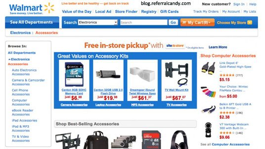
There are many e-commerce sites including Walmart, which emphasize their USP and customers start recognizing them with it and form an instant connection. Walmart’s USP is to offer competitive low prices and Walmart promotes this vision everywhere including homepage of their website.
The USP can also be presented in a highlighted banner, but for this the USP has to be quintessentially great and well defined.
In the above picture, the statement clearly explains what the company aims to do and how is it different from others. That’s exactly what a USP is meant for.
It is not necessary that USP must be mentioned only on the homepage of a website, it should be added on the other pages as well. These days many a times, customers reach new websites through search engines and it is quite possible that they might not land on homepage always. So, it is wiser from promotion point of view that your USP must be added on every page of the website, beside the mandatory homepage.
As Jacob Nielson from Nielsen Norman Group had once said that the first 10 seconds of visitors on a new website determine, whether they will stayor move. So while designing the website, keep in mind what do you want to show your visitors in first 10 seconds. More than anything else, it is important that the visitors must be able to grasp the USP at least; if they can they will stay back.
Right Positioning of USP on a webpage is as crucial as creating a good USP. USP positioning is the most effective, when it is placed on the top of the page, as it becomes the first thing that the website visitor will observe. From design’s point of view, it should be highlighted in a way that it fetches attention. It could be done by highlighting in a circle or a bubble for instance.
Most of the big websites, position their USP close to the brand logo, so that visitors or customers link the two and remember them together with a visual impression. In the competitive world, lot many efforts need to be put in showing that you have an edge over your competitors and that could best be conveyed with a short, well designed and well placed USP.
You can also consider few other design elements that will establish you as a different e-commerce site altogether. For instance, you can set a specific colour for the messages calling customers for actions and specific colour for the banners highlighting about the products and categories. If these colours are same as the colours used in the logo, they work as a reminder for the customers.
In the above picture, key points of the product are highlighted in orange colour, which is also a part of Amazon’s logo.
Keeping the above mentioned points in mind, think about the uniqueness in your business and design it in the best way and plan an effective position on your website pages. If the USP is displayed properly, it can do wonders for your business and bring traffic to your website. So what are you waiting for? Hire a professional web design company to highlight your USP and gear up to boost your sales.


