Call to Action messages are hard to miss on any ecommerce site. These messages make you take so many actions on the website, which you knowingly or sometimes unknowingly follow. But, not all call to action messages are followed so easily. Many online studies have suggested that the short and to the point call to action buttons are the most effective. Defining call to action message is not very tricky, it is a simple and quirky copy that can best convince and persuade your prospect customer to convert in a customer.
A recent study conducted by Online Marketing Coach and Small Business Trends suggested that more than 70% of the total ecommerce sites don’t have an apt call to action message on their site. This survey constituted a sample size of more than 200 sites.
Visitors search for call to action messages on ecommerce sites. These messages work as a bridge for what a person wants from that particular site. Most of the websites don’t miss to have call to action buttons.
A single call to action message can’t be apt for a plethora of e-commerce sites existing on worldwide web. Like different types of businesses the call to action messages need to be different as well. For instance, any site offering a special scheme, message saying “offer expires soon” works more than a simple “buy now” message. Similarly, when a visitor is viewing the product, message suggesting “Add to cart” is more effective and appropriate. The best call to action message for site offering software and services is “Download now”.
Below is a list of some call to action messages, which are short and effective. They say what they mean, have a look:-
- Click here
- Join now
- Sign up
- Add to cart
- Download now
- Get a free trial
- Talk to an expert
- Offer expires
- Assured Gift
- Money Back Guarantee
- Limited Stock
- Get it now
- Cash on Delivery
- Free Shipping/ No Shipping charges
- Try a free sample
A call to action doesn’t have to be used only for immediate conversion; it could also be an invitation for a different page. This type of call to action, most of the times, is used in the articles promoting ecommerce sites.
You may wonder, why these call to action messages are so important. Here are a few points that can help you in getting a clear picture of how well drafted and well placed call to action can work wonders for your website.
1.Good CTA Brings More Leads
In the above mentioned picture, the CTA has been placed logically and in an apt progression. The heading talks about the product, with bullets highlighting the features and then calling for Action message. This type of message does compel a visitor to click the link.
2.Better Navigation on Website
Besides helping in making more conversions, the effective Call to action messages also help giving your users a right direction and making your site more focused, as it defines what exactly you want from your visitors.
It is essential that before the call to action, the benefits or results of this action should be conveyed to the visitors, only then they will be tempted to click on the call to action. If a visitor has only a vague idea about the benefits of call to action, they might even drop the action.
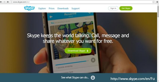
A great example of this is Skype. Before the call to action message saying Download Skype, a brief and clear copy conveys what Skype does and how it can help you.
Further, a detailed description of what Skype can do for its users comes in different pages that come by scrolling down. For instance,
And when the pages end a repeat of Call to Action is there for the visitors, as it is inconvenient for a visitor to scroll up back and look for the download button on website.
The call to action message should not be limited to your home page only; rather it should be on all the pages of your website, but in different forms. If a visitor reaches the website by clicking some link, they may land on some other page of your website, so the CTA should be there on every page to give them a further direction.
With the right copy, it is also mandatory that you give special emphasis on the designing aspect of your call to action. Some key points are:
- CTA should look big and can be highlighted with a bigger font
- It should have a bright colour to stand out on the page
- Position CTA strategically so that it is easily visible
- Not too many Call to Actions can work together, keep it to minimum
- Show urgency
- If possible give some perks
Hence, keeping the above points in mind and looking at the importance of an effective Call to action, hire a professional website design & development company, draft a strong call to action and get ready for better returns!


